WIP: Cover Designs for The Fall of the House of Usher
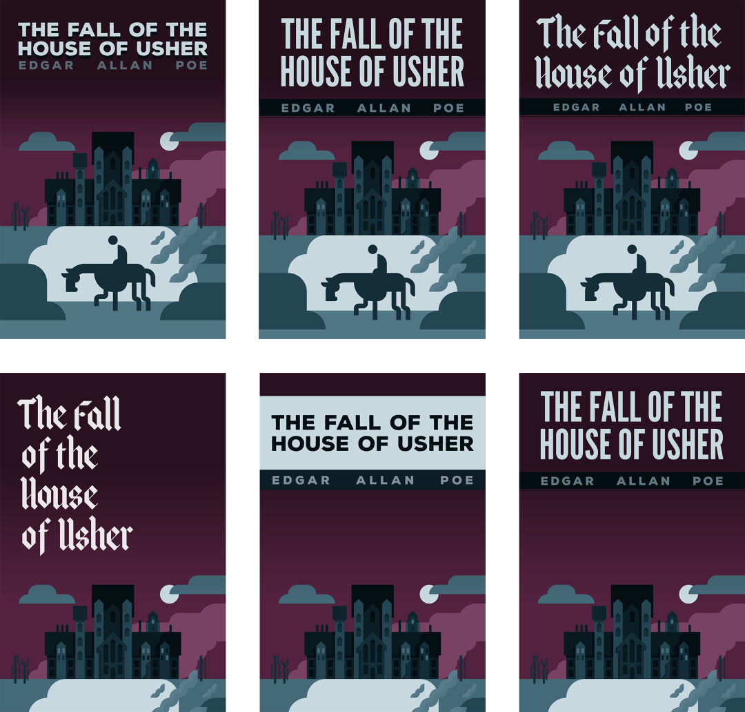
Here is a selection of covers. All of them are works in progress.

One of the reasons that I decided to start illustrating the book is because of how visually stimulating the writing is. The cover for the illustrated edition of “The Fall of the House of Usher” is inspired by the first paragraph of the story:
During the whole of a dull, dark, and soundless day in the autumn of the year, when the clouds hung oppressively low in the heavens, I had been passing alone, on horseback, through a singularly dreary tract of country, and at length found myself, as the shades of the evening drew on, within view of the melancholy House of Usher.
The goals of the cover are:
- Iconic cover: Create a cover in the style of the book illustrations: geometric, iconic images that should inspire rather than tell a full detailed story.
- Contemporary look: To distinguish itself from old covers, and to communicate that this illustrated edition is not a classically illustrated story, but a modern, geometric, graphic edition.
- Thumbnail friendly: Since this will be an ebook to be sold online (eg. Amazon), the image should work at small (as well as medium and large) sizes, be readable, etc.
I lost the first round of cover designs, and it was interesting to see how all the work I had put in the first series of covers, had somehow influenced the second wave. The experiments and trials were in my head even if I couldn’t physically look and reference them.
This made me wonder if I should start from scratch a third time, but then when should I stop? My engineering mind thinks that the better approach is to do A/B testing with the covers and let the public decide. Might try that.